

BRANDING / PACKAGE DESIGN / LABEL DESIGN
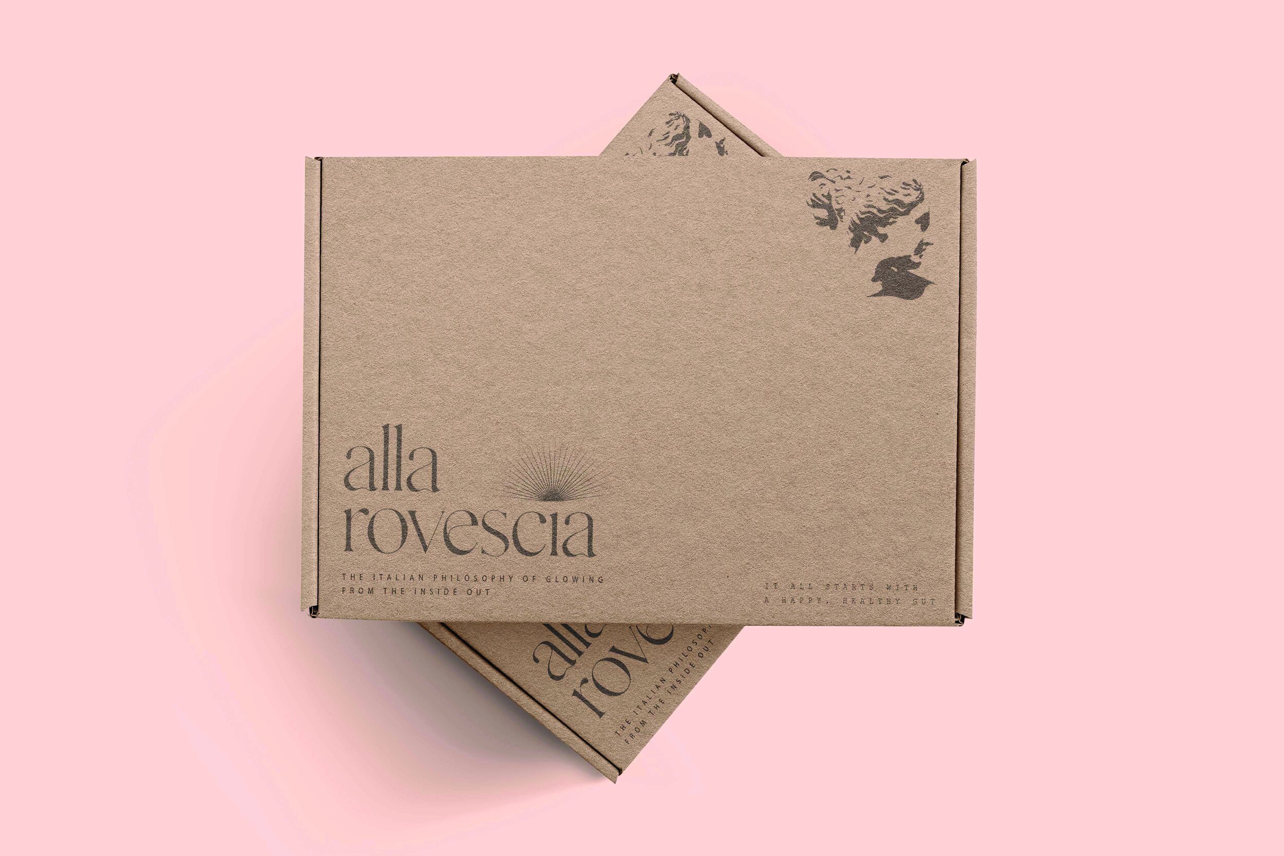
I went with a simple and elegant aesthetic for the logo and overall package design because it is more recognizable at a glace. I chose the typeface Gallient for its authentic handcrafted style, being clean, modern, and minimalistic, similar to the brand itself. The sunburst is a decorative motif that has roots in the halos surrounding figures in Italian medieval art.

BRANDING & AESTHETIC

SUB LOGO
The sub logo for Alla Rovescia is inspired from an Italian Revivalism bust. The bust is meant for instant recognition for the Italian brand. I added a hoop earring to give the sub logo a bit of a contemporary flare.
