PRINT MATERIALS
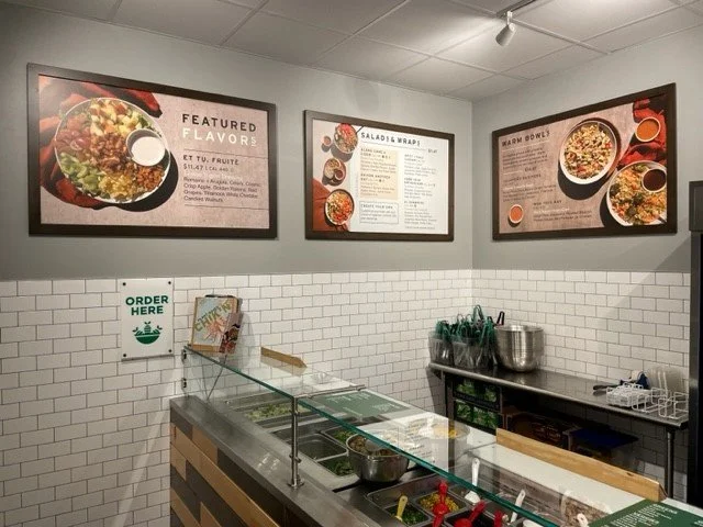
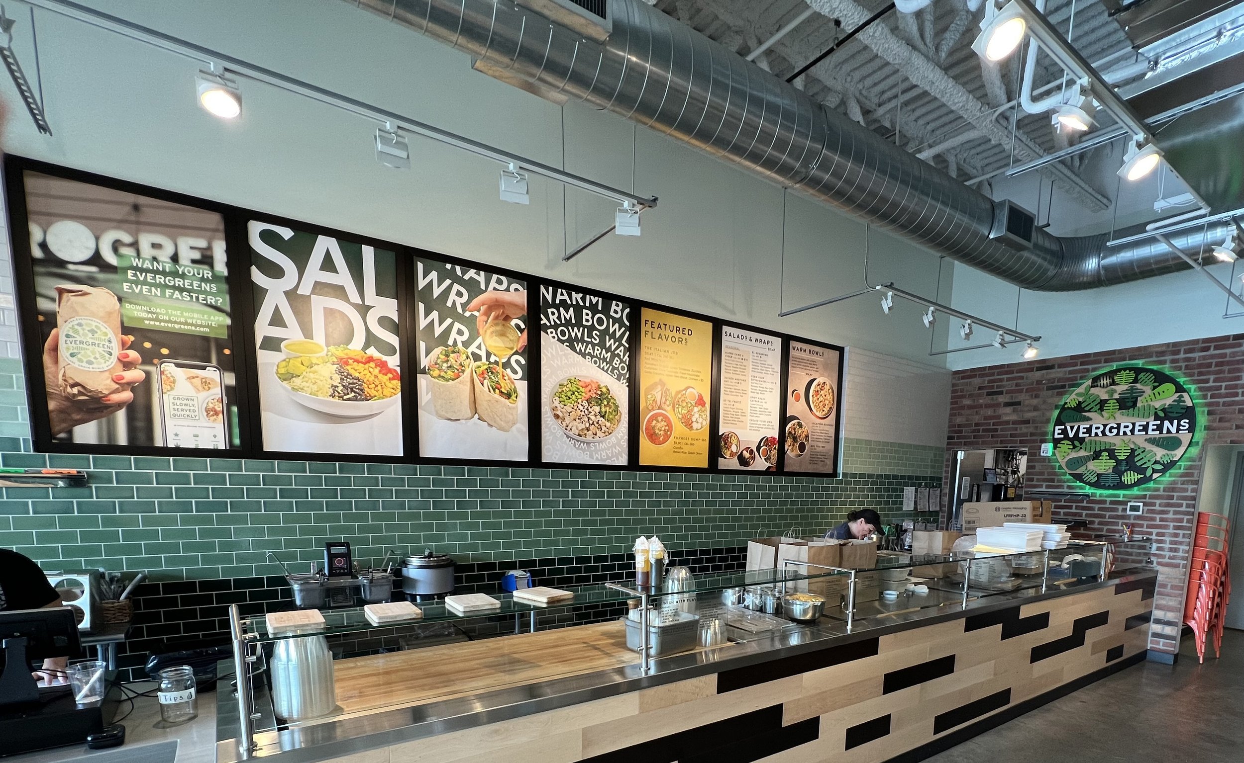
After nine years of operation, Evergreens' menu boards, store signage, gift cards, and trifold menus needed a major aesthetic overhaul. Previously, the design relied on an outdated color palette and the overused typeface, Interstate, which is common across many brands and everyday materials. Now, with the addition of tabletop and lifestyle photography, the boards feature a more modern and streamlined look. I conducted research to support a recommendation to the Director of Marketing for changing our branded typeface from Interstate to Europa. Europa, with its sans-serif roots in Futura, offers a sleeker, more contemporary, and overall cleaner appearance that better represents our brand. The secondary typeface chosen is Forrest, which combines old-style figures with a playful yet sophisticated and modern touch. All of the photography pictured in the designs was taken by Brooke Fitts and the EG in-house marketing team. Copy for print, digital, and social media was provided by the marketing team. At the bottom of this page will show photos of the campaign designs in real time.
MENU DESIGN


MISCELLANEOUS PRINT MATERIALS